
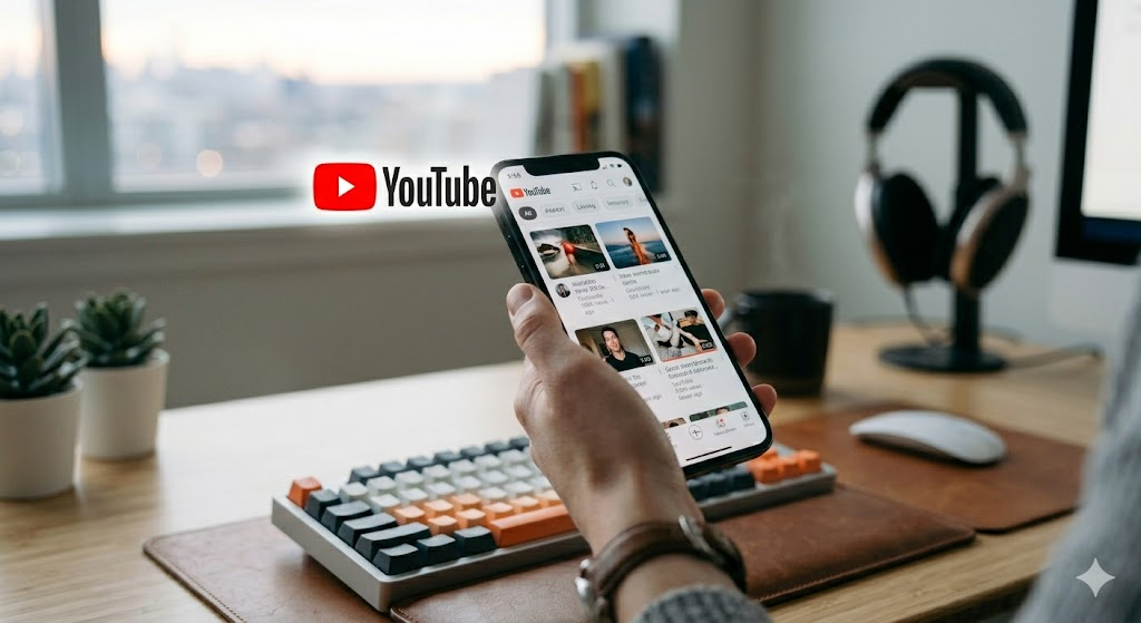
When you open your favorite app, the first thing you probably see is that familiar red, white, and black button. That YouTube logo is more than just a picture; it is the face of the world’s biggest video platform. Almost everyone recognizes this symbol instantly, no matter where they are. Whether you are watching a music video, a cooking tutorial, or a funny clip of a cat, that small icon reminds you that you are about to be entertained. It is truly amazing how a simple design can become such a powerful part of our daily digital lives.
A Brief Look at How It Started
The journey of the YouTube logo began back in 2005. At first, the design looked quite different from what we see on our screens today. The original version featured the word “YouTube” split into two parts. The word “You” was black, while the word “Tube” was inside a red rounded rectangle. This clever design was meant to look like an old television screen. It was simple, effective, and told people exactly what the site was for. Over the years, the company tested a few small changes, but the core idea of a “tube” remained the primary focus for a long time.
Moving Toward a Modern Look
As the platform grew, the YouTube logo needed to change to keep up with the times. Designers realized that the logo should look good on all kinds of devices, from giant computer monitors to tiny smartphone screens. They started to flatten the design and brighten the red color to make it pop. By removing extra shadows and complex textures, the icon became much easier to recognize in a crowded list of apps. This shift toward a clean and simple look is a classic example of modern graphic design that focuses on clarity and user experience.
The Big Red Play Button
One of the most important changes happened when the platform introduced the iconic red play button as a standalone symbol. People began to associate this specific shape with the YouTube logo almost immediately. By moving the play icon out of the “Tube” box, the brand created a versatile mark that works everywhere. You see this button on thumbnails, social media icons, and even on physical devices like smart TVs. It is a brilliant way to make sure the brand is visible even when there is no room to write out the full name of the company.
Why the Colors Matter
Have you ever wondered why the YouTube logo uses so much red? In the world of design, red is a very strong color. It grabs your attention and makes you feel excited. It is often used to represent energy, passion, and urgency. By pairing this bright red with simple white and black, the designers created a look that is bold and easy to read. This color combination is one of the reasons why the brand stands out so well against the white background of a browser or the dark mode of a mobile phone.
Consistency Across All Platforms
One of the best things about the YouTube logo is how consistent it stays across every platform. Whether you are using a gaming console, a laptop, or a tablet, you always know which app you are opening. This is not an accident. The design team works hard to make sure the icon looks the same everywhere. When a brand is consistent, it builds trust with the users. We know that when we click that red button, we are going to get a high-quality video experience that we can rely on every single time.
The Cultural Impact of the Symbol
Today, the YouTube logo is recognized by billions of people around the globe. It has become a symbol of creativity and voice. Anyone with a smartphone can share their story with the world, and that tiny red icon is the gateway for it. It has transcended being just a corporate image to become a part of pop culture. You can find the icon on merchandise, in advertisements, and even in street art. It represents a place where everyone has the chance to learn, laugh, and connect with people who share their unique interests.
Understanding the Design Language
If you look closely at the YouTube logo, you will see that it uses very clean lines and simple geometry. This is part of a design strategy called “minimalism.” By stripping away unnecessary details, the logo communicates its purpose instantly. The play button, which is essentially a triangle pointing to the right, is a universal symbol for “start” or “go.” This makes the brand accessible to people of all ages and languages. You do not need to speak English to understand that the red button means you are about to watch something new and exciting.
Adapting for Small Screens
As we moved into the age of mobile apps, the YouTube logo had to adapt to fit on tiny home screens. Designers had to ensure that the icon stayed legible even when it was very small. By focusing on the shape of the play button, they ensured that the app could be identified in a split second. This kind of thoughtful design is why the platform has been able to keep its users engaged for so many years. It is all about making the user’s experience as smooth and simple as possible from the very first tap.
The Future of the Brand Identity
The world of digital media is always changing, and the YouTube logo will likely continue to evolve. Even though it is perfect right now, designers are always looking for ways to make things better. We might see shifts in color shades or slight tweaks to the shape of the play button as screen technology improves. However, the heart of the brand—the idea of connecting people through video—will always remain the same. The logo will continue to act as a beacon for creators and viewers in this ever-changing digital landscape.
Summary Table: Evolution of the Brand Mark
| Era | Key Features | Primary Goal |
| 2005 | “Tube” in red box | Establish video identity |
| 2011 | Lighter red, gradient | Modernize for web |
| 2015 | Flat design, clean lines | Improve mobile visibility |
| 2017+ | Play button icon | Create a versatile brand mark |
Frequently Asked Questions
1. Who designed the original YouTube logo?
The original design was created by the founders of the platform, Chad Hurley, Steve Chen, and Jawed Karim, to keep things simple during the startup phase.
2. Why is the YouTube logo red?
Red represents energy, excitement, and urgency, which helps the brand stand out and encourages viewers to click and engage with content quickly.
3. What does the play button represent?
The triangle pointing to the right is a universal symbol for “play,” telling users that clicking the icon will start a video or media file.
4. Can I use the YouTube logo on my website?
You must follow Google’s brand guidelines if you want to use their logo to ensure you are not misrepresenting your own content as an official part of the platform.
5. Has the logo always been red?
Yes, the red color has been a part of the brand identity from the very beginning, though the specific shade and design style have changed over time.
6. Why is the logo so simple?
Simplicity makes the logo easy to remember and easy to recognize on any device, from a massive television to the smallest smartphone screen.
Conclusion
The YouTube logo is a masterclass in effective branding. It shows us that you do not need complicated shapes or fancy words to make an impact. By staying true to its core purpose and adapting to new technology, the platform has created an icon that we see every single day. Next time you click that red play button, take a second to appreciate the design that brings millions of stories to your screen. What is your favorite thing about the platform? Let us know in the comments below!